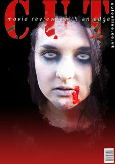
After the audience feedback I recieved from my first attempt at a magazine cover, that it was too basic, it lacked some of the features exisiting magazine covers have. Also that I needed to make it more identifyable as a low budget horror magazine.
I went on to create two versions of two different pictures, using more storys and attempted to show different features in the magazine also.
Version 1:
The problems I found with this is that the quality of the picture when blown up big is quite poor.
Version 2:


No comments:
Post a Comment