Monday, 28 February 2011

Evaluation question 1 - In what ways does your media product use, develop and challenge forms of real media products?

In what ways does your media product use, develop and challenge forms and conventions of real media products?
When first embarking upon creating my zombie horror teaser trailer, I wanted to create a high quality trailer which reflected the codes and conventions of a professional teaser trailer, incorporating the features which are included. The genre of zombie horror I am working with is also hard to create realism, and stray away from comical aspects. So to create this verisimilitude, I looked at a range of existing texts and pulled intertectual references to gain inspiration and ideas for my own production.
Creating a promising zombie character was perhaps my greatest challenge.  There are two types of zombie typically seen in zombie horror films,  George.A.Romeros slow moving zombie, which is often seen in films such as Night Of The Living Dead (1968) or a modern take on the zombie character in films such as 28 days later by director Danny Boyle.  I decided to go with the more modern take on zombie, this was for a number of reasons. One being to get a preffered reading from my target audience who are generally of a younger generation, who will be familiar with the more modern take on the zombie character. The film I mainly looked at from a zombie aspect is 28 Days Later (2002) by Danny Boyle.

I took inspiration from the 28 days later trailer and considered it as one of the most important sources I looked at, as it gave me an idea of how I wanted my trailer to look like and the general features which are incorporated.  The use of the white writing at the beginning on a black background with words which are related to the genre ‘Exposure’ etc, is something I wanted to incorporate into my product. A clever way of building suspense, with flickers of the film inbetween to give a glimpse of horror then speeds up with quick editing, messing with the heartbeat.


When considering real media products in the zombie horror genre, special effects and make-up are a huge part of creating a realistic zombie look. I made this section an important priority. Whilst researching I came across Tom Savini who was known as George Romeros wingman. I looked up his work on various past horror films Dawn Of The Dead (IMDB) and Friday 13th..(IMDB)


                                          Tom Savini

After studying the way in which he incorporated make-up for a zombie look, I went on to experiment with my own. I used white make-up and black shadow to signify a dead-look, using fake-blood to signify the gore factor. Below are some extra pictures taken by me on set whilst producing the special effects.


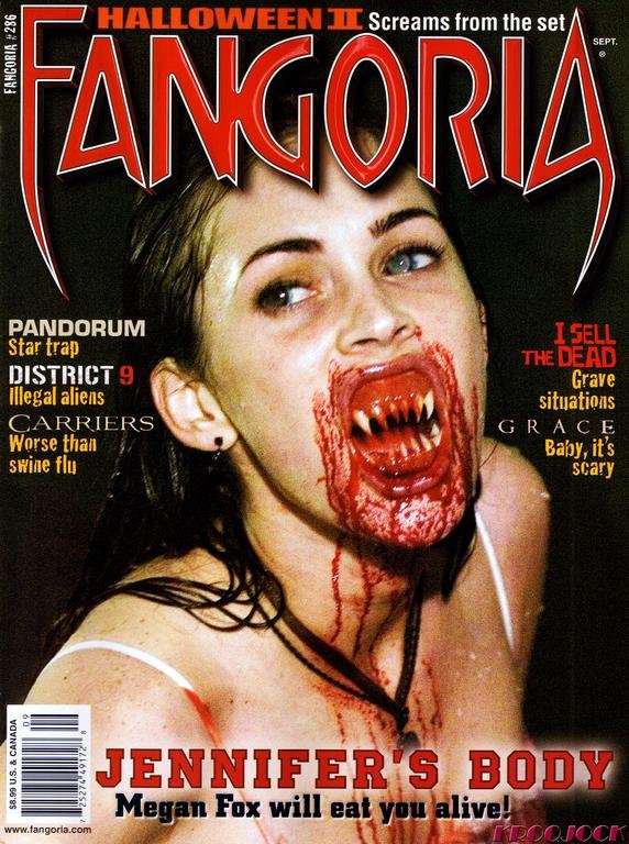
I wanted my ancillinary texts to reflect real media products, these texts include a film magazine cover and film poster. When creating my film magazine cover, I wanted to include features on actual film magazine covers such as Empire, the biggest film magazine in the U.K and Total Film magazine. These features included a bold title, I chose ‘CUT’ to relate to the general film theme, but also incorporate the horror genre. I also included feature pictures, which show what is inside the magazine. The other feature stories are horror related, as it is a low-budget horror film magazine. This includes an exclusive interview with legendary make-up artist Tom Savini and up and coming summer zombie horror films.


Like most typical zombie films, the zombie represents something significant. For example a particular generation or social group. I decided for my zombie cast to represent a region of the u.k. Southerners came up to the north for a weekend away, where the find out the yorkshire dales is infected. They then become lost and go on a terrifying journey of being attacked/chased/infected etc. They are the worst group of people you could possibly face e.g a group of mobs.


Soundtrack

I used the software Garage Band on the MACS, which was relatively easy to use. Considering I had used it in my A.S production I was able to move on quickly with producing it. I experimented with the different instruments provided for me, using synth sounds which are more suitable to create a creepy music track. From previewing various trailers, I found that the music starts slower at the beginning and becomes quicker. This is what I tried to achieve producing a few different pieces.

Re-draft of Magazine cover.

After recieving feedback from the previous drafts of the magazine covers I created, I again re-drafted my magazine cover. I took the feedback which I recieved, that I should change the background picture because it was too similar to the poster. I lowered the 'CUT' title, to incoporate a feature add of fake blood, which is often seen in many exisiting products. I changed te font to make it stand out more, also making the star 'ALICE TAYLOR' bigger.

The various stages created on photoshop:


AUDIENCE FEEDBACK FROM DRAFTED MAGAZINE COVERS.

-Try and take some additional photographs, some of the pictures you have looked at are quite bad quality and pixelated.

-Look at more extensive research into magazine covers, there are generally more stories incorporated.

-Good use of photoshop, try experiment with different fonts also however.

Final draft of poster

When I did my first draft of my poster, people were impressed by the close-up image and effetcs. However felt it lacked features and aspects which would be on real media posters. I then went back to photoshop to finalise my final draft of my poster, I incorporated reviews which are an important aspect of a poster and made fonts bigger in places.

background image


Final draft

.Storyboard and Screenplay

Specific horror magazine research.

Fangoria. (official website)

First named in 1978 under Fantastica, made as a companion to the science fiction media magazine Starlog (just as Starlog covered science fiction films for a primarily teen audience, fantastica was designed to cover fantasy films for a similar audience. (official website, fangoria magazine)
- This is particulary important for me as I will be producing a magazine cover of a horror genre and will be targetting a similar audience.

Joe Bonham edited the first issue, shortly after publishing, the competitor of Starlog films, Fantastic films magazine pressed unfair trading and that the magazines would be too similar for the audience. (official website).


Horror film magazine covers have their own identifiable features, such as typical red, black and white colours. These to signify blood, death, gore and the serious attitudes and themes but forward in horror films. The font is also quite specific, bold font and font which  had a fang effect on it to add further anchorage for horror fans and the audience.

The stories are also horror related, giving me a taste of what type of stories I should include in my magazine and on the cover.

production logo.

When embarking upon creating a production logo I researched exisiting media products to enable me to produce a realistic product.
Some of these include:
 I liked the PIXAR (OFFICIAL SITE) production logo and wanted to create something similar which would reflect the genre I was working with, the simplicity of the background but the power of the writing was something I wanted to achieve
 These are the production logos I created to represent my teaser trailer, they were done in the programme Photoshop where I experimented with different background effects and fonts, the red to clearly signify blood and give anchorage into the genre, the blood dripping is clearly a stereotypical way to signify horror but I feel it works generally well.