
Tuesday 22 March 2011

Thursday 17 March 2011
Evaluation question 4-How did you use new media technologies in the construction, research, planning and evaluation stages?
How did you use new technologies in the construction, research, planning and evalutauion stages?
Each stage of media production is produced and evaluated within a veriety of different media technologies, this is included in research, planning and editing.
Within my research and planning stages, the initial part of my project I used various websites to upload my horror trailer research such as Traileraddict (website), Youtube (website) and IMDB (website). IMDB was particulary useful as it gave you detailed information about the film you were researching, including director, date of release, budget etc.

To receive audience feedback I used the typical way of receiving it through cam corder footage, however I then investigated into using different types of media technologie to get the feedback. These include Twitter and Facebook, which are particularly valuable as they are easy and quick to set up, whilst you can recieve a large amont of varied feedback as they are large social networking sites. Also within my target audience they work very well, as the people I communicate with are generally that particular audience 18-25.
Blogger was my way of storing information, enabling me to save it without it being lost, online and easy to access. As it auto-saves regularly, it's a very reliable way of storing work and presenting it. However I often found it difficult to upload videos, which isn't a major problem as I have a youtube account and can recieve the embed code from there, but is more time consuming. Sometimes I could only upload a few pictures at once, which again was time consuming but a reliable way of saving, uploading and presenting them on my blog. I uploading pictures I took with a still camera outside my blog, which I then went to use on my ancillary text.
Photoshop (official site)was a programme I used alot in my ancillary tasks, I had little experience using photoshop but after tutorials I got to grips with it. It was a great media technologie to use as I could pull apart pictures, create a variety of effects, add filters to create a scary zombie look which was obviously benefitial.
For my magazine cover I did a variety of drafts, one with a close-up image, adding a filter and 'chiller' font, then adding various pictures at the bottom to show features within the magazine.
I then went on to another draft after receiving feedback, I used a similar layout but considered features of existing products more and incorporated a different background image.
To create my soundtrack I used the software Garage Band, (official site) I had experience of using this tool last year and was fairly comfortable with using it. I experimented with different sounds and instruments provided my the software, using sythnesizer sounds and church bells to create a ghostly sound. I could overlay these sounds and mix them together. After creating the tracks I would save the projects into a software programme called I-movie, I used this programme last year so was relatively comfortable with it. It then got put into final cut when edited down with the footage.
I edited my main product, after importing it into I-movie and basically editing it in there.
Evaluation question 3- What have you learnt from your audience feedback?
What have you learned from your audience feedback?
Audience feedback is a vital form of media production. Attracting an audience is what initially a product is created for. Appealing to your target audience is one of the most important factors included in this aspect of production. For this audience to get a prefered reading. the producer needs to understand the codes and conventions of the specific genre they are working with, what appeals to their target audience and if there is a gap in the market for their product.
To understand this fully receiving audience feedback allows you to receive criticisms, improvements and strengths, from people who understand the genre and media form you are working with. This is what I set out to do.
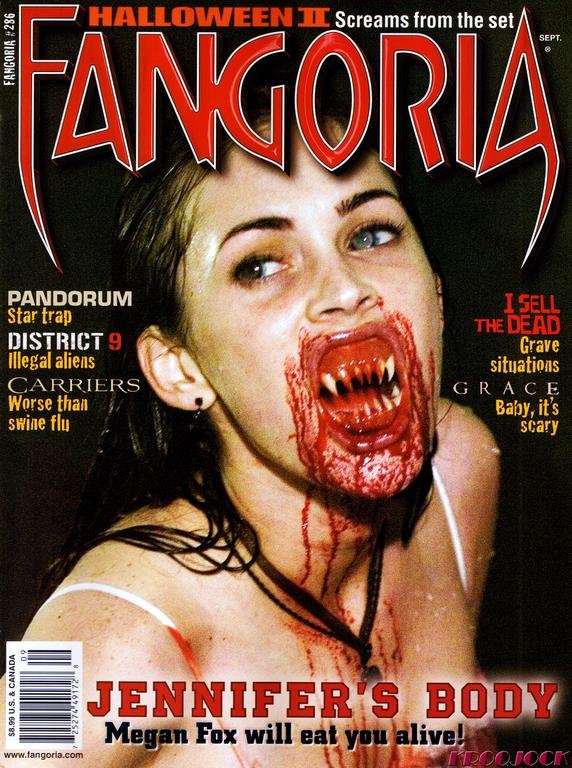
When considering my ancillary tasks, the film magazine cover and film poster, I produced a draft of both. Here I received feedback from fellow students of written notes, video footage and new media technologies such as Twitter and Facebook. Within my written notes I received feedback which led me to realize that I needed to do more research into magazine covers, their features and consider things such as font etc. This is also applicable to my poster, and many people said I needed to look at horror specific posters and magazines such as Fangoria, the biggest selling horror magazine in the U.S.
Other written comments include:
. You could produce a range of different magazine covers and posters featuring different characters, as part of a franchise. This would relate to real media products such as Harry Potter.
.Directors name and star 'ALICE TAYLOR' needs to be bigger on the poster.
.Reveiws on the poster - very important.
Twitter (wiki) Feedback.
A social networking and microblogging service, enabling its users to send and use messages.
This is a great way for audience feedback as it allows you to advertise to an audience you may not beable to otherwise, to complete strangers who can 'tweet' you comments and feedback, or your followers, who are generally friends and people you know of.
Here below is just some evidence of my audience feedback from twitter and shots of me sharing my drafts of my magazine cover and poster.
Evaluation question 2 - How effective is the combination of the main product and Acillinary texts?
2) How effective is the combination of the main product and Ancillinary texts?
The most significant part of my project is generally thought of as the main final production piece - my zombie teaser trailer. However to anchor in any audience, particulary my target audience and raise awareness of the production task, I had to produce two ancillinary tasks, one a film magazine cover, and two a film poster. Both to advertise my film 'Dead North'.
Two film magazine covers:


I wanted the zombie theme to be strong throughout my production and tasks, the same 'chiller' font is used on the poster and film magazine cover to introduce the title 'Dead North' this is to link in the two tasks, whilst staying within the zombie horror genre. It is filled in at the bottom with red to signify blood. I believe the zombie horror is portrayed within these tasks as the effects I used on photoshop emphasised the gore, with blood dripping down the close-up image of the face and the ghostly effects. I think it works particulary well as you can easily identify that it is the same cast used from the different images, therefore finalising it is the same zombie horror production. The certificate rating of 18 I have given it I believe is reflected in the ancillinary tasks aswell as the main production. I tried to make the poster and film magazine cover as shocking as possible, with the bold close-up image of the face.
Film Poster:

I have kept the two ancillinary tasks relativley similar when considering font and images, the features are clearly different and are easily identified as two different ways of advertising, but for the same production. The magazine cover features a veriety of different feature stories that would be incorporated within the magazine, this is to show the realism of the product. Also showing behind the scenes images to make the cover visually more attractive and to anchor in an audience.
The black, red and white writing is a bit of a theme used within the main production and the two smaller tasks. This is to signify again the gore and seriousness of the genre, but also as a kind of trademark for the film, a recognisable colour theme perhaps which may grab audiences.
Monday 28 February 2011
Evaluation question 1 - In what ways does your media product use, develop and challenge forms of real media products?
In what ways does your media product use, develop and challenge forms and conventions of real media products?
When first embarking upon creating my zombie horror teaser trailer, I wanted to create a high quality trailer which reflected the codes and conventions of a professional teaser trailer, incorporating the features which are included. The genre of zombie horror I am working with is also hard to create realism, and stray away from comical aspects. So to create this verisimilitude, I looked at a range of existing texts and pulled intertectual references to gain inspiration and ideas for my own production.
Creating a promising zombie character was perhaps my greatest challenge. There are two types of zombie typically seen in zombie horror films, George.A.Romeros slow moving zombie, which is often seen in films such as Night Of The Living Dead (1968) or a modern take on the zombie character in films such as 28 days later by director Danny Boyle. I decided to go with the more modern take on zombie, this was for a number of reasons. One being to get a preffered reading from my target audience who are generally of a younger generation, who will be familiar with the more modern take on the zombie character. The film I mainly looked at from a zombie aspect is 28 Days Later (2002) by Danny Boyle.
I took inspiration from the 28 days later trailer and considered it as one of the most important sources I looked at, as it gave me an idea of how I wanted my trailer to look like and the general features which are incorporated. The use of the white writing at the beginning on a black background with words which are related to the genre ‘Exposure’ etc, is something I wanted to incorporate into my product. A clever way of building suspense, with flickers of the film inbetween to give a glimpse of horror then speeds up with quick editing, messing with the heartbeat.
When considering real media products in the zombie horror genre, special effects and make-up are a huge part of creating a realistic zombie look. I made this section an important priority. Whilst researching I came across Tom Savini who was known as George Romeros wingman. I looked up his work on various past horror films Dawn Of The Dead (IMDB) and Friday 13th..(IMDB)
Tom Savini

After studying the way in which he incorporated make-up for a zombie look, I went on to experiment with my own. I used white make-up and black shadow to signify a dead-look, using fake-blood to signify the gore factor. Below are some extra pictures taken by me on set whilst producing the special effects.


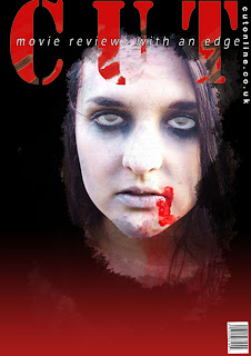
I wanted my ancillinary texts to reflect real media products, these texts include a film magazine cover and film poster. When creating my film magazine cover, I wanted to include features on actual film magazine covers such as Empire, the biggest film magazine in the U.K and Total Film magazine. These features included a bold title, I chose ‘CUT’ to relate to the general film theme, but also incorporate the horror genre. I also included feature pictures, which show what is inside the magazine. The other feature stories are horror related, as it is a low-budget horror film magazine. This includes an exclusive interview with legendary make-up artist Tom Savini and up and coming summer zombie horror films.


Like most typical zombie films, the zombie represents something significant. For example a particular generation or social group. I decided for my zombie cast to represent a region of the u.k. Southerners came up to the north for a weekend away, where the find out the yorkshire dales is infected. They then become lost and go on a terrifying journey of being attacked/chased/infected etc. They are the worst group of people you could possibly face e.g a group of mobs.
Soundtrack
I used the software Garage Band on the MACS, which was relatively easy to use. Considering I had used it in my A.S production I was able to move on quickly with producing it. I experimented with the different instruments provided for me, using synth sounds which are more suitable to create a creepy music track. From previewing various trailers, I found that the music starts slower at the beginning and becomes quicker. This is what I tried to achieve producing a few different pieces.
Re-draft of Magazine cover.
After recieving feedback from the previous drafts of the magazine covers I created, I again re-drafted my magazine cover. I took the feedback which I recieved, that I should change the background picture because it was too similar to the poster. I lowered the 'CUT' title, to incoporate a feature add of fake blood, which is often seen in many exisiting products. I changed te font to make it stand out more, also making the star 'ALICE TAYLOR' bigger.
The various stages created on photoshop:


AUDIENCE FEEDBACK FROM DRAFTED MAGAZINE COVERS.
-Try and take some additional photographs, some of the pictures you have looked at are quite bad quality and pixelated.
-Look at more extensive research into magazine covers, there are generally more stories incorporated.
-Good use of photoshop, try experiment with different fonts also however.
Final draft of poster
When I did my first draft of my poster, people were impressed by the close-up image and effetcs. However felt it lacked features and aspects which would be on real media posters. I then went back to photoshop to finalise my final draft of my poster, I incorporated reviews which are an important aspect of a poster and made fonts bigger in places.
 background image


 Final draft

 background image

 Final draft
Specific horror magazine research.
Fangoria. (official website)
First named in 1978 under Fantastica, made as a companion to the science fiction media magazine Starlog (just as Starlog covered science fiction films for a primarily teen audience, fantastica was designed to cover fantasy films for a similar audience. (official website, fangoria magazine)
- This is particulary important for me as I will be producing a magazine cover of a horror genre and will be targetting a similar audience.
Joe Bonham edited the first issue, shortly after publishing, the competitor of Starlog films, Fantastic films magazine pressed unfair trading and that the magazines would be too similar for the audience. (official website).

 Horror film magazine covers have their own identifiable features, such as typical red, black and white colours. These to signify blood, death, gore and the serious attitudes and themes but forward in horror films. The font is also quite specific, bold font and font which had a fang effect on it to add further anchorage for horror fans and the audience.
The stories are also horror related, giving me a taste of what type of stories I should include in my magazine and on the cover.
First named in 1978 under Fantastica, made as a companion to the science fiction media magazine Starlog (just as Starlog covered science fiction films for a primarily teen audience, fantastica was designed to cover fantasy films for a similar audience. (official website, fangoria magazine)
- This is particulary important for me as I will be producing a magazine cover of a horror genre and will be targetting a similar audience.
Joe Bonham edited the first issue, shortly after publishing, the competitor of Starlog films, Fantastic films magazine pressed unfair trading and that the magazines would be too similar for the audience. (official website).

The stories are also horror related, giving me a taste of what type of stories I should include in my magazine and on the cover.
production logo.
When embarking upon creating a production logo I researched exisiting media products to enable me to produce a realistic product.
Some of these include:
 I liked the PIXAR (OFFICIAL SITE) production logo and wanted to create something similar which would reflect the genre I was working with, the simplicity of the background but the power of the writing was something I wanted to achieve
 These are the production logos I created to represent my teaser trailer, they were done in the programme Photoshop where I experimented with different background effects and fonts, the red to clearly signify blood and give anchorage into the genre, the blood dripping is clearly a stereotypical way to signify horror but I feel it works generally well.


Some of these include:


Sunday 27 February 2011
Additional magazine cover photos.


Software
I am using a number of different technologies, some new and some old to create and produce my project,
Photoshop CS4
This programme allows me to edit my ancillinary tasks to a high level of quality. This was apparant when I started making my film poster and film magazine cover, I could over layer images, experiment with verious filters and colour effect which fit in perfectly with the genre I'm working with.
Garage Band
This programme I am familiar with from last years project, it helps me to create the music which will fit into my piece of work. I soon realised after watching various horror trailers that the music/sound is extremly important, it can effect the mood or how the audience portrays the product. This programme allows you to experiment with different instruments and different tones to create the sound you want.

Final Cut
A brand new and unkown programme to me, with using I movie last year to create my project. Final cut is a more sophisticated and professional way of editing a production, with neater cutting tools and a larger variety of editing tools.
Tuesday 22 February 2011
Book Of The Dead: By Jamie Russell
Blurb.
AMAZON.
When there's no more room in hell...
One of cinema's most enduring monsters, the zombie has been terrifying audiences around the world for decades. Book Of The Dead charts the ghoulish history of zombie cinema, from the creature's origins in Haitan voodoo and its cinematic debut in 1932s White Zombie (IMDB), right up to recent blockbuster hits like 28 days later (imdb), Shaun Of The Dead (imdb) and Land Of The Dead (imdb).
Covering hundreds of movies from America, Europe and Asia, this extensive history chronicles the zombie's on-screen evolution from Caribbean bogeyman to flesh-eating corpse. Along the way, Book Of The Dead takes in Bela Lugosi B-movies, Italian Gore films, blind monk-zombies, shot-on-video backyard epics, all-time classics such as I Walked With A Zombie, Night Of The Living Dead (IMDB) and Dawn Of The Dead (IMDB) and the videogame phenomenon of Resident Evil (WIKI).
Complete with hundreds of stills and artwork including 64 stunning pages of colour illustrations, and an exhaustive filmography, Book Of The Dead explains why we continue to be so fascinated by these fugitives from the undertaker.
...the dead will walk the earth.
I used this book to help me extensivly with my zombie research, it gives valuable information about a range of zombie horror films created from a wide variety of artistic views.
The chapters include:
Caribbean Terrors.
The Zombie Goes To Hollywood
Down And Out On Poverty Row
Atomic Interlude
Bringing It All Back Home
Dawn Of The Dead
Splattar Horror
Twilight Of The Dead
Zombie Filmography
Thursday 17 February 2011
Target Audience.
If making this film in a full length narrative, a high level of gore/horror would be used due to the extent of special effects. The rating I would give the film would be 18, so the teaser trailer is rated the same. The general target audience would be people aged 18-24, people aged 16 plus are however likely to watch it on release of DVD.
The target audience would be a higher proportion of a male audience. This is mainly due to it being a low-budget zombie horror film - it's quite a raw and basic horror film, with lots of gore. This is the rating I believe the BBFC would give my zombie horror film
BBFC (British Board Of Film Classification)
I also need to consider nationality, ethnicity and social class.
Most films even if spoken in the English language are offered in subtitles also. My film is in the English language so will generally targetted at people who speak the english language, however I will offer various subtitled languages which in the long run may help my low-budget zombie flick gain a wider audience. The genre isn't particulary aimed at any ethnicity inparticular and their arn't any ethnicity related themes included in my zombie horror flick.
Wednesday 16 February 2011
'His name was Jason' 30 years of friday 13th.
'His Name was Jason' DVD - 30 years. (IMDB)
Amazon link.
This DVD is significant on a number of different levels, not only linking into the horror genre I am basing my project in. But containing interviews with proffessionals within the movie industry, including Tom Savini, the one particular make-up artist I used within my work.
Trailer of DVD.
Monday 7 February 2011
Analyisis of various horror trailers
28 days later (28dayslaterthemovie) 28 DAYS LATER (2002)
Background information: 2002 zombie horror film directed by Danny Boyle. Screenplay was written by Alex Garland. The basic storyline and plot follows the storyline of the release of the highly contagious 'rage' and focuses the struggle of four survivors.
Non-Diajetic sound used, harsh and loud music to signify a serious mood/tone. White documentary style writing on a black background, to give information on setting/location and narrative. Qucik shots and fast-pace editing used to fasten the pace which links in with the genres codes and conventions. Non-diajetic screaming heard to make the audience feel uneasy. Words which link in to genre such as 'Exposure' and 'Infection', used as effect as they are bold uneasy statement words often used in a negative way. Used of red colouring for the words to signify blood. Flashy editing used, shots of rats to signify dirt and abandonment. Further shots of fire and explosion to add to the theme of horror. The use of the main protagonist introduced in this trailer where he has no clothes on, gives a further contributing factor that he is really on his own, signifying he is bare and exposed. The music is played at certain points, to build up tension and then create a shock factor. Long-shots of London abandoned signifys civilisation isn't present anymore, his voice echoing in London is a huge shock factor considering the reputation is has of the hustle and bustle of one of the most important cities in the world.
Shaun of the dead (wiki)
The Realease date lied in 2004, where the budget consisted of over $4m, directed by Edgar Wright the production company was forwarded by Studio Canal and Working Title.
Dawn Of The Dead (2004) (wiki)
Budget: £28m
Production companies: Strike entertainment
Analysis.
.People holding weapons- suggests violence and perhaps and 18 certificate rating.
Pace of the trailer changes when shots of people and fire on the streets, abadonment.
.Steady and slow music over production logos.
.music slows down again as titles come onto screen.
HOSTEL
2005
$4.5m
.Mentions the directors past films ( common factor in trailers)
.Titles fade in and out and are done in serif font.
.Music gets louder as the editing and footage becomes quicker (something I want to invlove in mine)
ZOMBIELAND (wiki) ZOMBIELAND (offical International site
2009
COLUMBIA PICTURES
.Music stops when it comes to a kery comedy part
.Fast pace editing- mess with heartbeat and quicken the pace.
-Sans serif font used.
Establishing shot
-Main character- stereotypical masculin dominating male.
Other horror films I looked at Modern and Old:
Frankenstein (1910) (IMDB)
The phantom of the opera (2004)(IMDB)
Dr Jekyll and Mr.hyde (1931)(IMDB)
The Tell-Tale Heart (1934)(IMDB)
The Body Snatcher 91945)(IMDB)
13 Ghosts (1960)(IMDB)
Psycho (1960)(IMDB)
The birds (1963)
The haunting (1963) (IMDB)
A nightmare on Elm street (2010)(IMDB)
Childs Play (1988)IMDB)
Final Destination (2000)IMDB)
The grudge (2004)IMDB)
I looked at all these trailers to get a general idea of the horror genre, the themes used and the stereotypical codes and conventions. This then hopefully enabling me to achieve a realistic teaser trailer.Some of the horror movies without trailers were still benefitial for me to watch, to get a general overview og horror plots.
Saturday 5 February 2011
Up and coming horror films 2011.
I researched the up and coming horror films of 2011, firstly zombie horror films to link in with my genre, but horror films in general to use as a feature on my low-budget horror magazine cover.
Scream 4.(IMDB)
Directed by Wes Craven.
Priest (2011) (IMDB)
Rabies 2011 (IMDB)
Evidence 2011 (IMDB)
Grave Encounters 2011 (IMDB)
Source from Up and Coming horror films - http://www.upandcominghorrormovies.com/
Also searching on youtube - various trailers came up which I may have never discovered. They all link togetether within the horror/thriller genre.
Thursday 3 February 2011
Adapted narrative outline.
As I found difficulty in accessing a pub to shoot as a location due to time issues, I slightly adapted my narrative outline to rather than include the pub, include a more diverse range of shots to make up for the fewer locations. Here I explain what I want to include in my narrative.
Magazine cover drafts
After the audience feedback I recieved from my first attempt at a magazine cover, that it was too basic, it lacked some of the features exisiting magazine covers have. Also that I needed to make it more identifyable as a low budget horror magazine.
I went on to create two versions of two different pictures, using more storys and attempted to show different features in the magazine also.
Version 1:


 The problems I found with this is that the quality of the picture when blown up big is quite poor.
Version 2:


I went on to create two versions of two different pictures, using more storys and attempted to show different features in the magazine also.
Version 1:


Version 2:


Subscribe to:
Posts (Atom)